
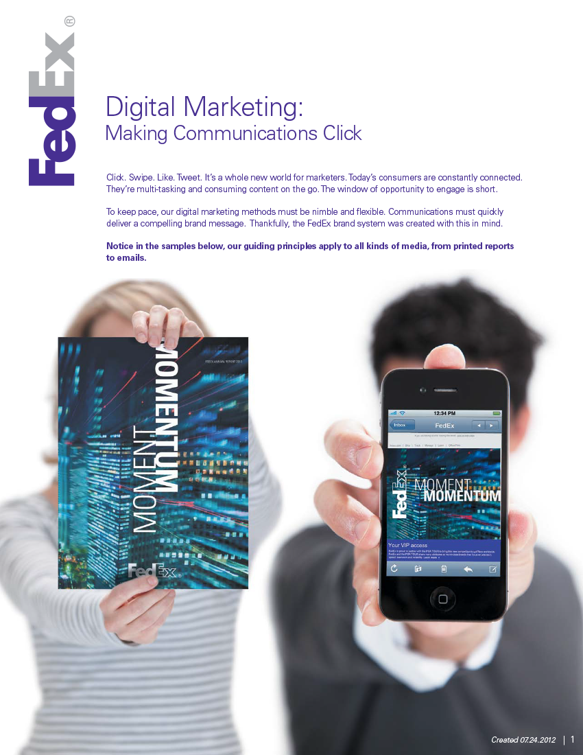
Making a global brand easier to use
At FedEx, brand consistency was not just a design concern — it was an operational one. I helped turn a massive, often-misinterpreted guideline system into clearer, more usable tools that supported brand understanding across teams and agencies.
Brand Systems
The Challenge
FedEx had an established global brand system, but using it correctly across a large organization was another matter.
The official guidelines were extensive. The FedEx Brand Overview alone was 48 pages — and that was the condensed version shared with internal teams. With multiple agencies, teams, and operating companies creating materials, there were frequent gaps between what the guidelines said and how the brand was actually being applied.
The issue was not a lack of rules. It was that the rules were too easy to misunderstand, over-interpret, or ignore in fast-moving creative workflows. The brand team needed a better way to help people apply the system correctly without requiring everyone to become a brand expert.
The Idea
Make the brand easier to use, not just easier to police.
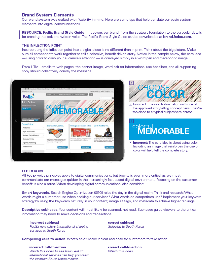
I managed and maintained the brand guidelines, but I also looked for ways to make them more useful in the real world. After seeing where outside agencies and internal teams were consistently missing the mark, I worked with print and digital designers to create quick-reference sheets focused on common problem areas.
These were designed as practical teaching tools — something the brand team could send during review cycles to explain not just that something was off, but why, and how to fix it. Instead of relying only on a giant guideline document, we created lighter-weight resources that made the brand easier to understand in context.
I also helped develop a presentation for the FedEx Office brand that clarified its attributes, look and feel, and how it differed from other FedEx operating companies. That work helped brand users better understand nuance inside a large parent brand, where consistency mattered but sameness was not the goal.
The Result
The result was a more usable brand system — one that supported better alignment across teams, agencies, and operating companies.
By translating a dense set of rules into practical guidance, I helped the brand team improve how the system was understood and applied. The quick-reference tools gave reviewers a clearer way to educate brand users, and the FedEx Office presentation helped teams navigate the distinctions within a complex brand architecture.
This work made the brand easier to govern, easier to teach, and easier to use well.
BEHIND THE WORK
What I like about this project is that it shows brand as a system, not just a visual identity.
In a large organization, brand consistency does not happen because a guideline PDF exists. It happens when people can understand the intent, apply the rules in real situations, and make better decisions without constant correction.
That was the real work here: turning a large, rigid document into something more actionable, more teachable, and more useful across a complicated organization.