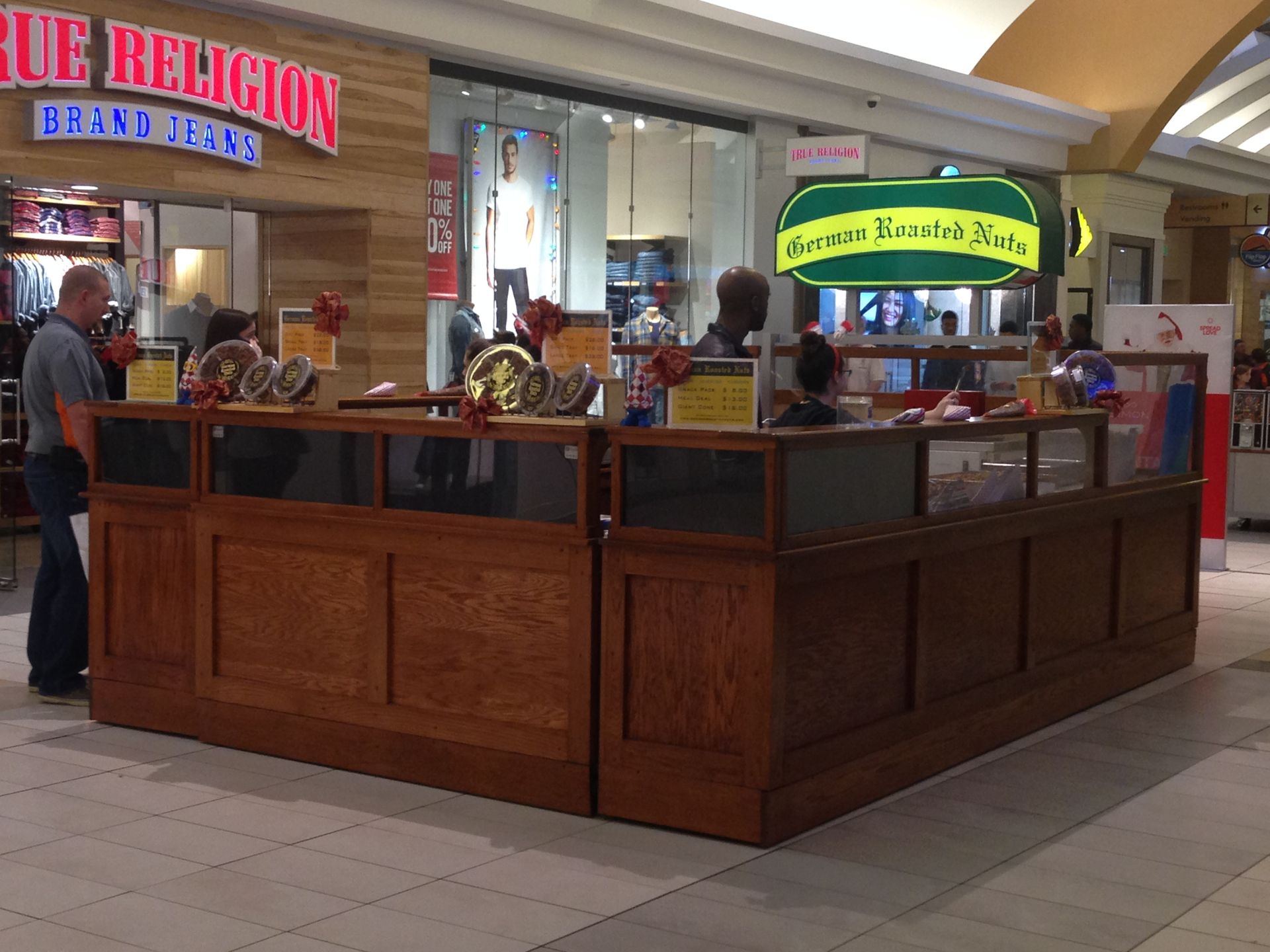
Turning a snack stand into a brand
This project never made it to market, but it’s still makes me smile every time I think about what could have been. The client wanted to evolve beyond a mall kiosk and build a more premium, expandable brand – one that could stand apart from copycat “German roasted nuts” businesses and grow into something bigger.
Brand Concept • Packaging
The Challenge
At the time, the business existed as a kiosk in the Nashville mall and had plans to grow through new kiosks, festivals, online sales, and an expanded product line that could eventually include things like corporate gifts and products beyond German roasted nuts.
The challenge was that the current name and look were familiar, but also limiting. The market had become crowded with businesses using the same “German roasted nuts” language and similar visual cues, making it harder to stand out. At the same time, the client wanted a more premium brand – something people would seek out and happily pay more for.
The Idea
After research, customer observation, and competitive review, I developed multiple naming directions and three distinct creative concepts with different personalities and growth potential. The earlier strategy work explored goals like premium positioning, broader food expansion, and differentiation from other “German Roasted Nuts” sellers.
The three original concepts
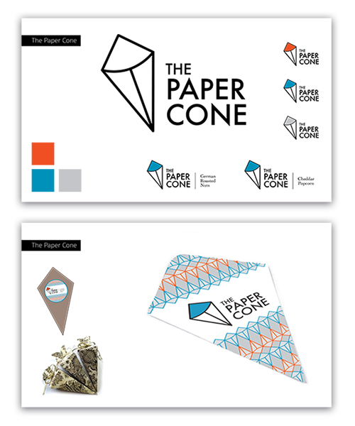
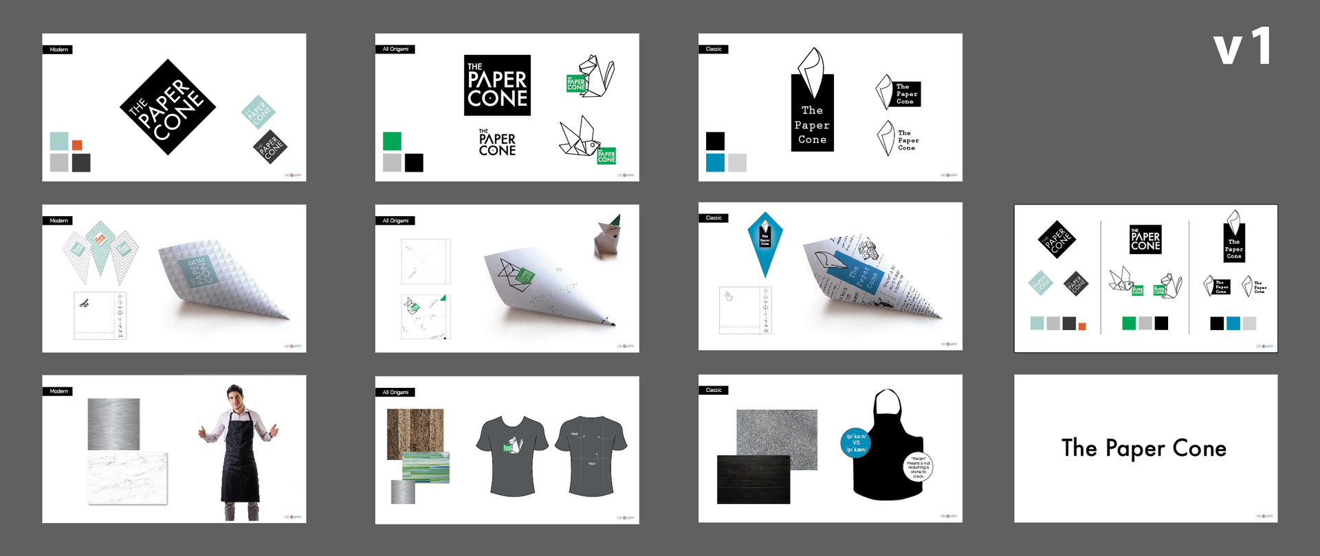
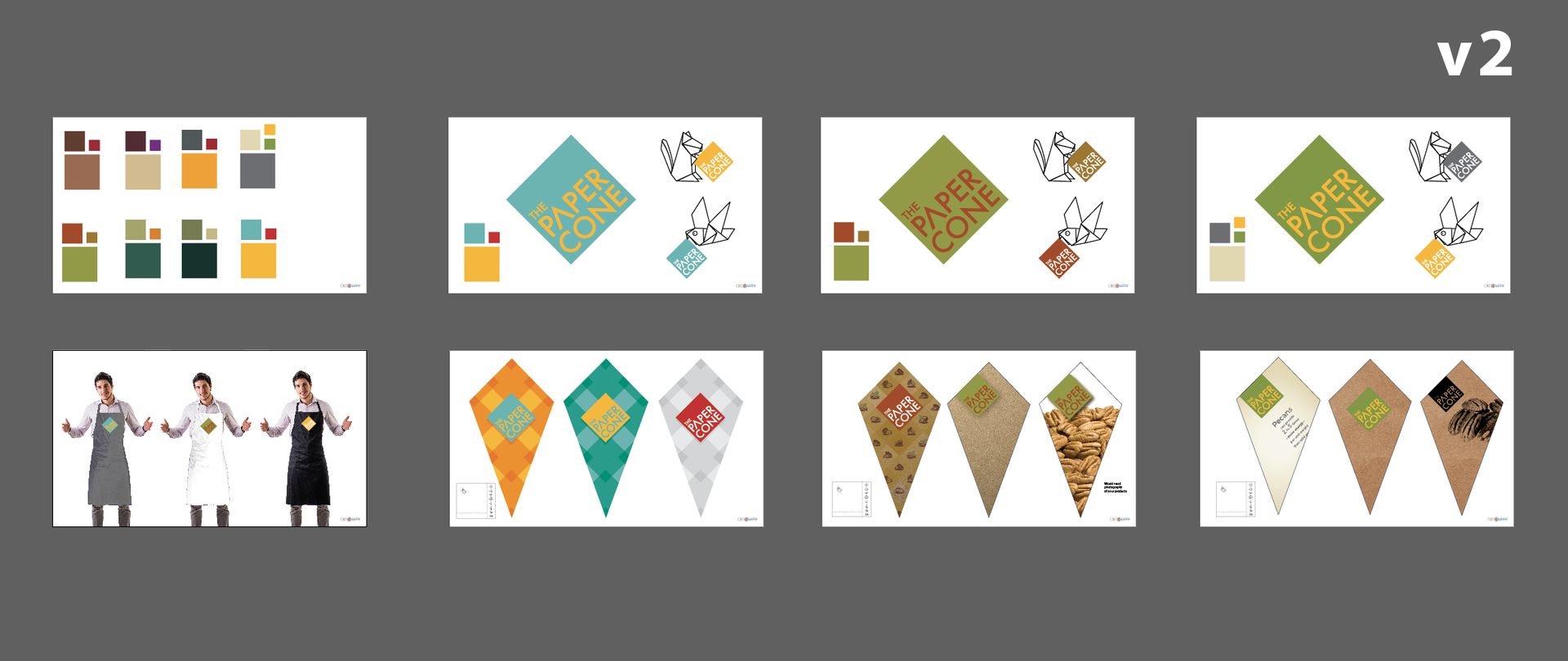
The Paper Cone
A concept built around the most recognizable part of the experience: the cone itself. It features a folded-cone logo, bright accent colors, and packaging patterns that could flex across products.
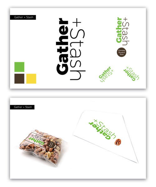
Gather + Stash
A more playful, premium direction rooted in squirrel/chipmunk behavior, storing up good things, and the idea of having a special stash. The strategy work included “stash,” “gather,” and related language in the naming exploration, and the visual concept leaned into that sense of collecting something worth keeping.
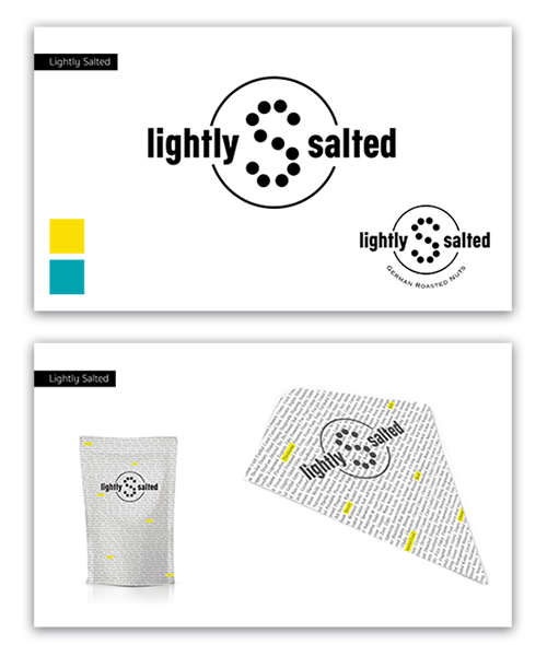
Lightly Salted
A more graphic, modern option with a bolder, more editorial feel. The packaging is full of flavor and sensory words, which would be highlighted based on the product in the package.
The client chose The Paper Cone, and I developed that direction further through logo explorations, cone packaging, merch, and visual applications.
My favorite part was the packaging idea: instead of the paper cone becoming instant trash, the paper could include simple origami instructions so it could be folded into a small animal after the snack was gone. A snack and a tiny activity. Amazing.
BEHIND THE CONCEPT
What I love about it is that it started with a very ordinary retail format and treated it like it deserved a bigger idea. The client was selling warm roasted nuts in paper cones, but the real opportunity was to turn that small moment into a brand people remembered – one that felt more premium, more distinct, and more expandable than a typical mall kiosk.
That’s what made The Paper Cone such a strong direction. It was simple, ownable, rooted in the actual customer experience, and flexible enough to grow into something more.