
Creating a bolder brand for Whisky Chicks
Whisky Chicks already had a loyal following, but the brand was not doing enough to welcome new people in. I helped reposition it with a more approachable, confident, and modern identity – then brought that direction to life across the website, voice, merch, events, and member experience.
Brand Creation
The Challenge
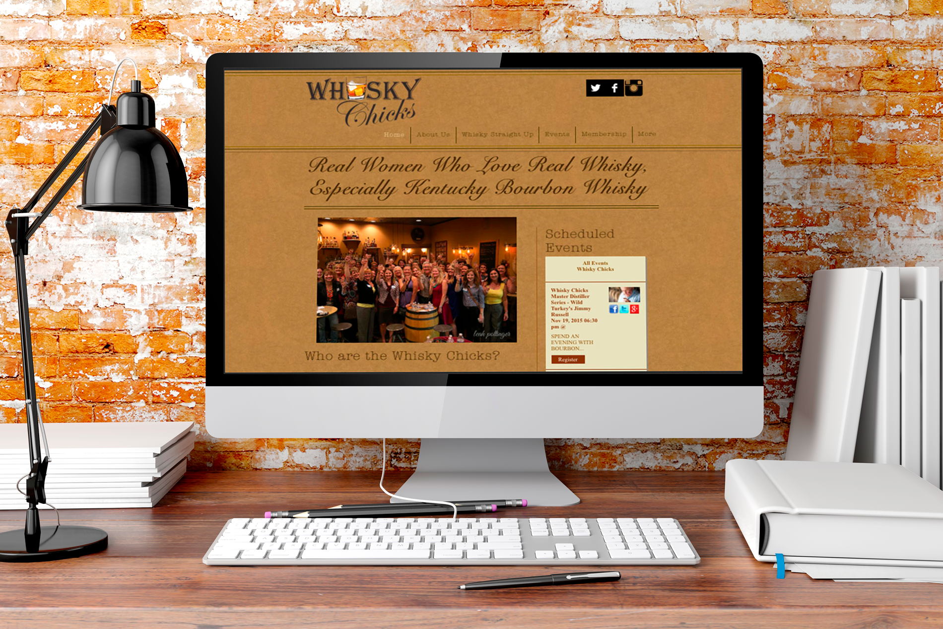
The original Whisky Chicks brand felt dated and narrow. It leaned a little old-timey and did not fully reflect the kind of experience the organization wanted to create: approachable, bad-ass, educational, and welcoming to a broader group of women interested in whisky.
They needed more than a visual refresh. They needed a brand that felt clearer, more current, and more alive in the real world – something that could connect across digital touchpoints, events, and merchandise while still feeling true to who they were.
The Idea
Create a brand that felt modern, confident, and easy to join.
I developed three distinct brand concepts, each with its own visual direction and tone. One kept more of the old-timey character but updated it for a more modern audience. One pushed in a much more contemporary direction, with a bolder logo and graphic patterns. The third landed in a more classic, simple space – modern, but still grounded.
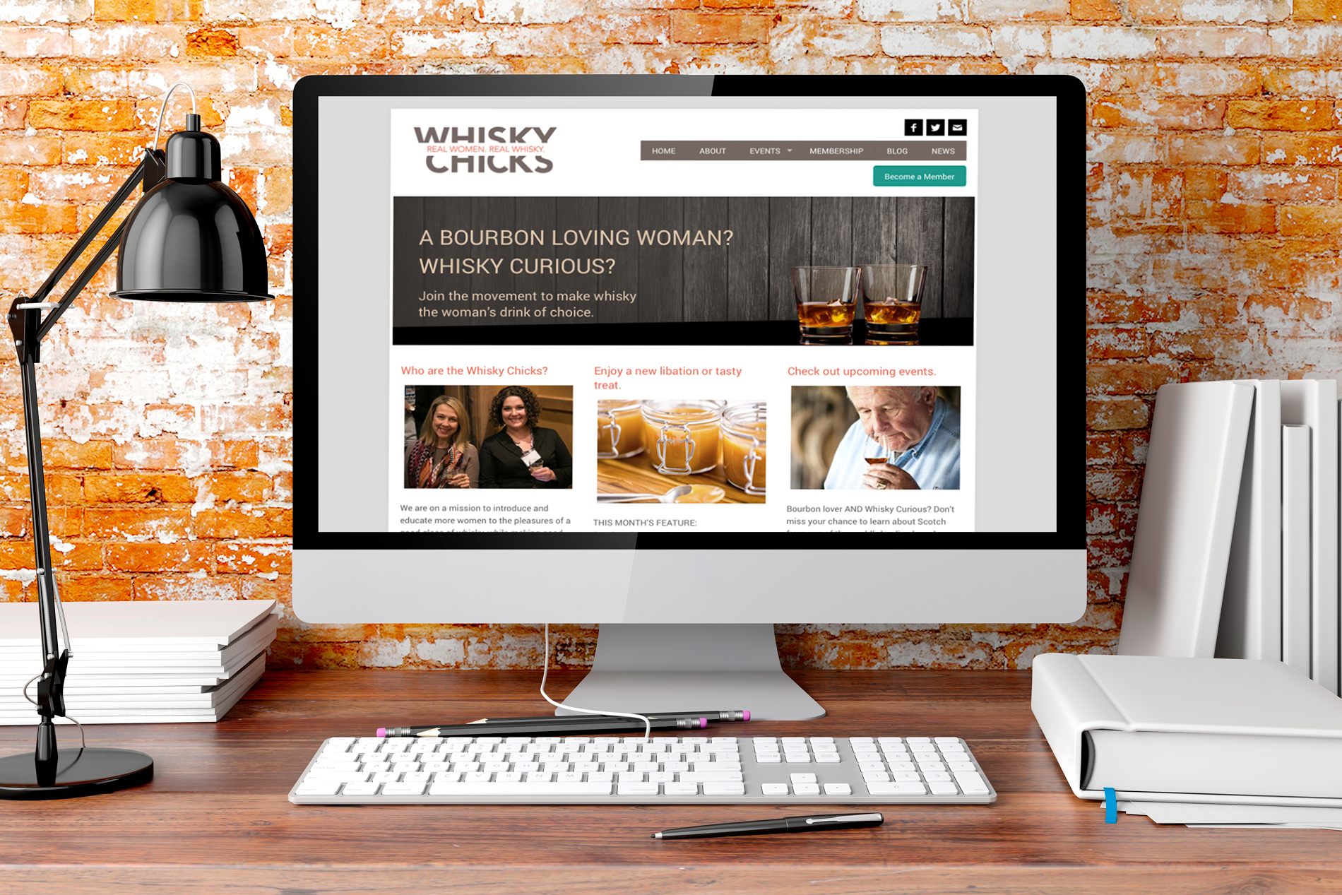
That final direction became the chosen path.
From there, I translated the brand into a full system: logo, color palette, voice, website direction, merch concepts, signage, and event materials. A key part of the identity was the line "REAL WOMEN. REAL WHISKY." – a message that helped anchor the tone and make the brand feel both welcoming and self-assured.
The Result
The updated brand gave Whisky Chicks a clearer identity and a stronger way to connect with modern women looking for community, education, and a more approachable way into whisky.
Once launched, the new website achieved a 17.1% conversion rate, giving the organization a measurable lift alongside a stronger look and voice. Beyond the website, the refreshed brand carried through to merch, signage, event materials, and the broader member experience — helping the brand feel more consistent, more memorable, and more lived-in.
BEHIND THE WORK
What I like about this project is that it shows brand as something people step into — not just something they look at.
The work was not only about creating a better logo or a prettier website. It was about shaping the feeling of the brand: who it invited in, how it spoke, what it stood for, and how consistently that showed up across all the places people encountered it.
That mix of strategy, voice, visuals, and real-world rollout is one of my favorite kinds of brand work.